
An introduction to my A-Level Graphics course, I worked on different colour schemes and integrating them to create designs around the idea of Experimental Typography.
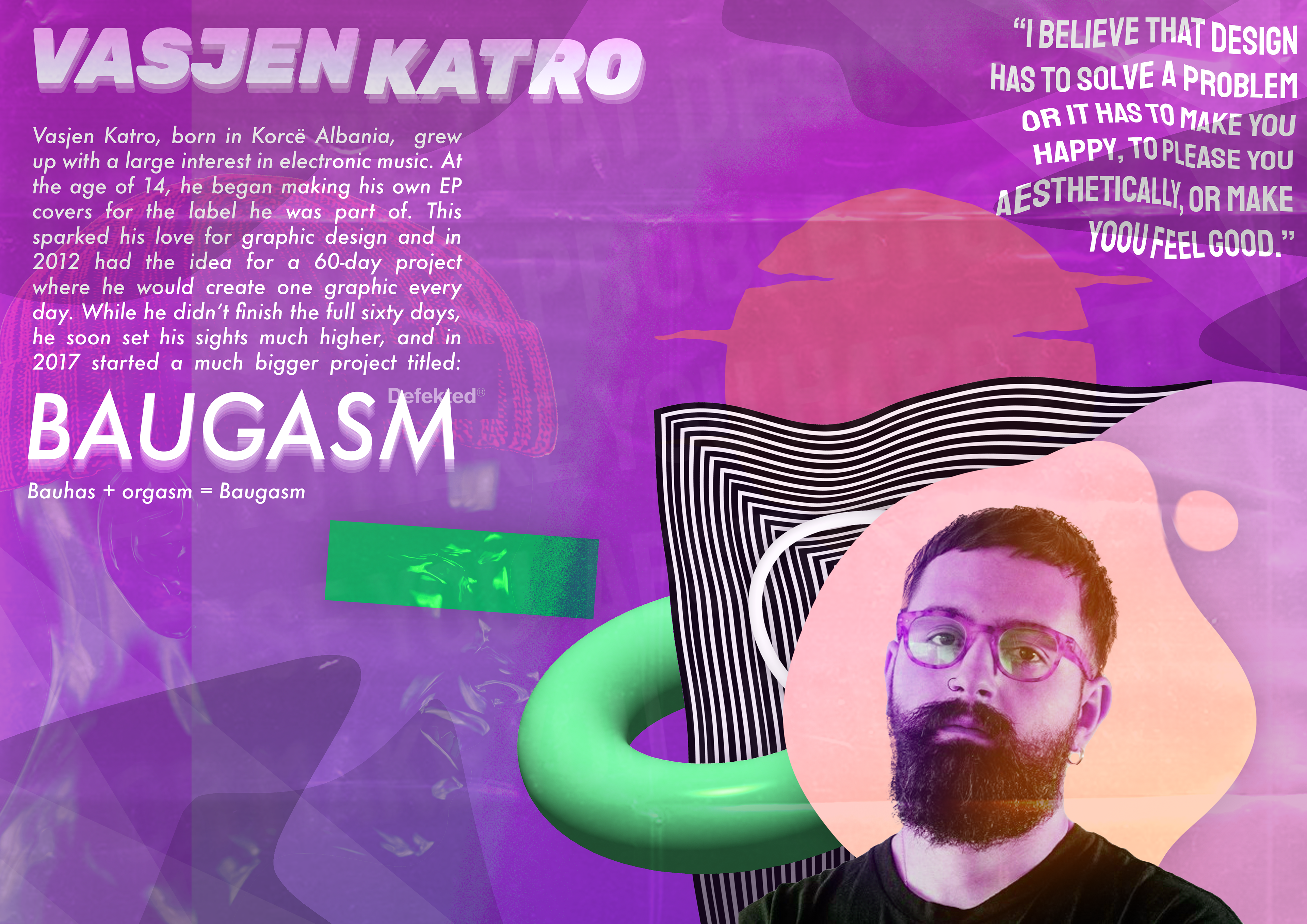
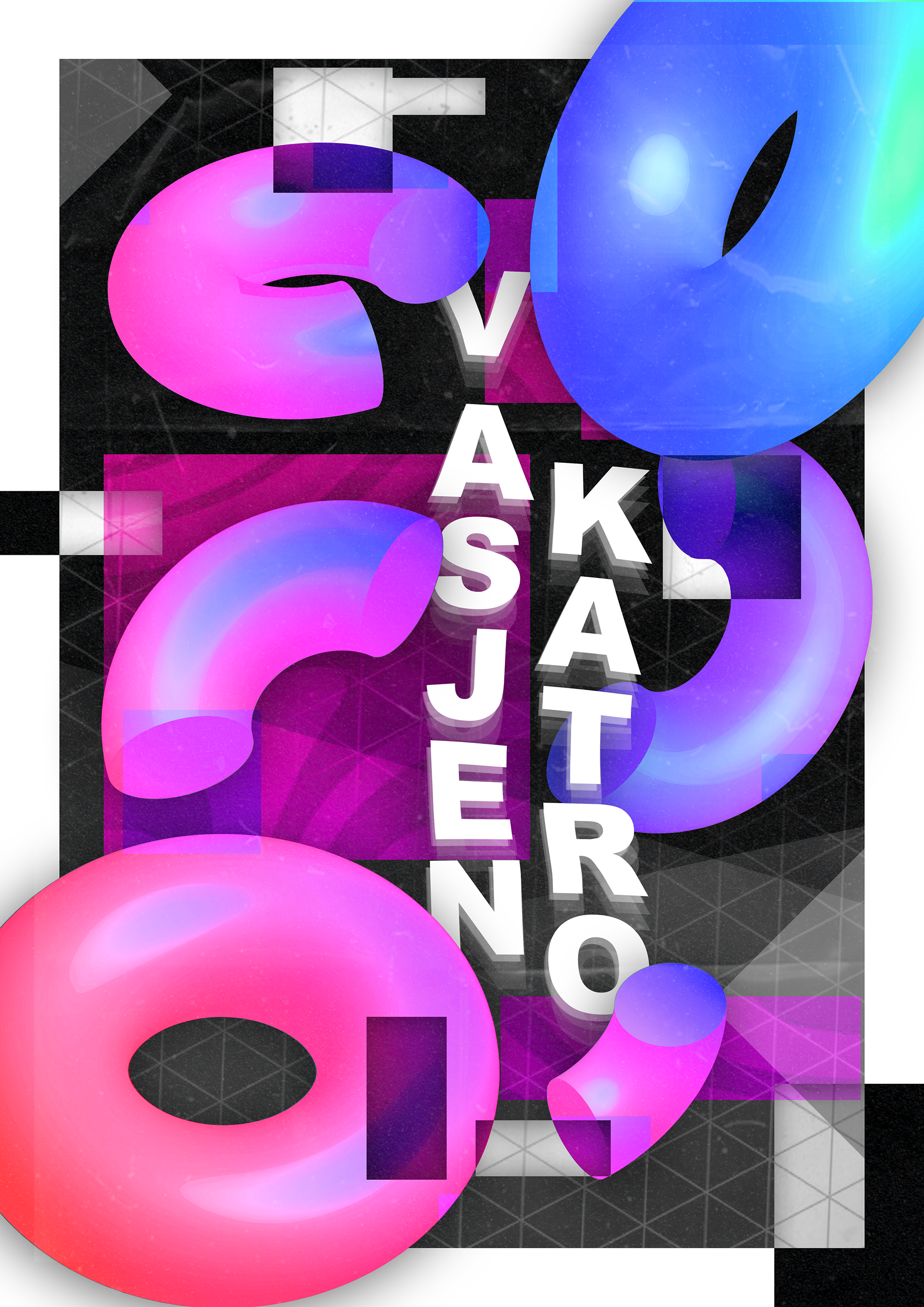
Vasjen Katro Artist Research
Balance Poster Workshop
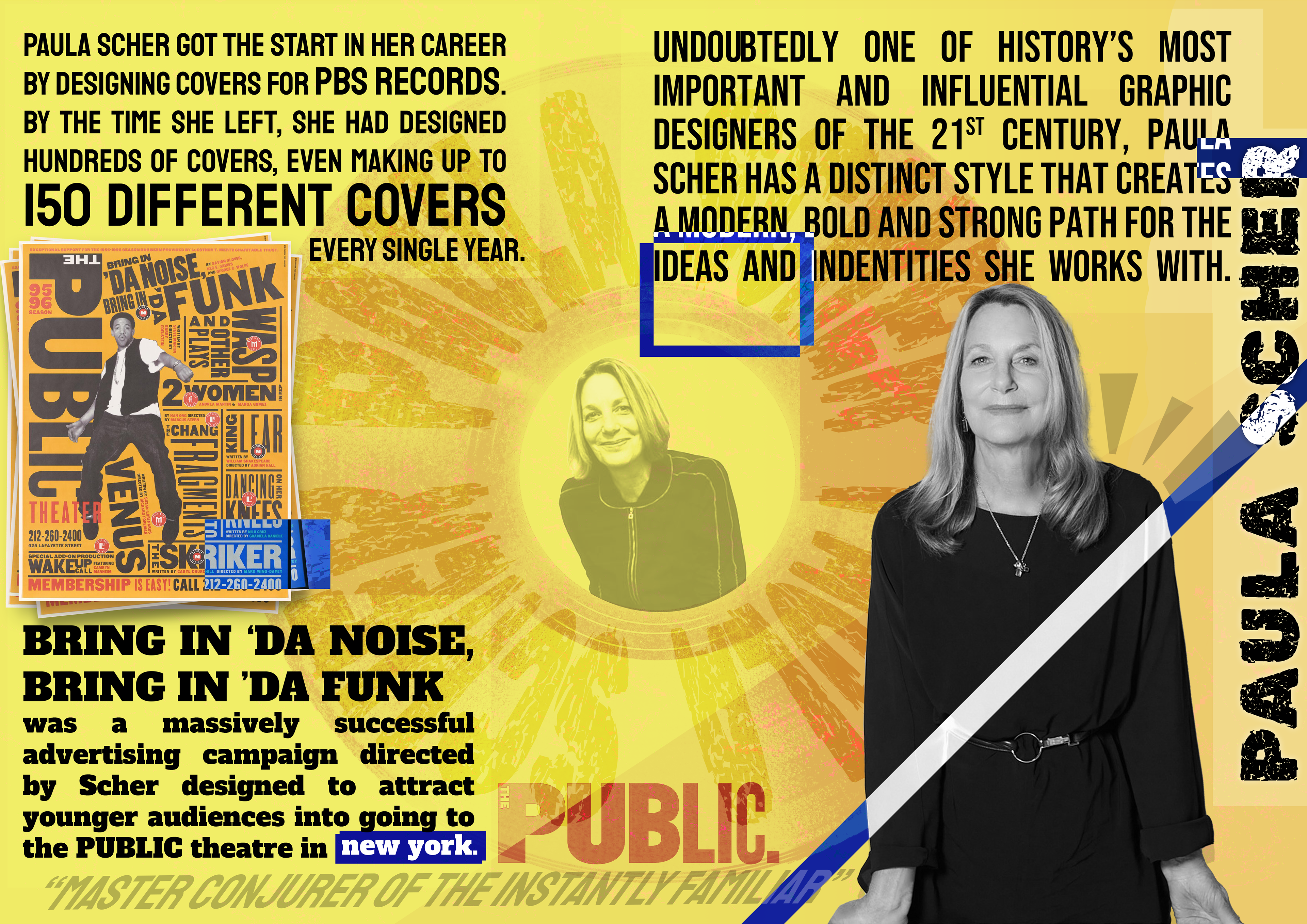
Paula Scher Artist Research
Contrast Poster Workshop
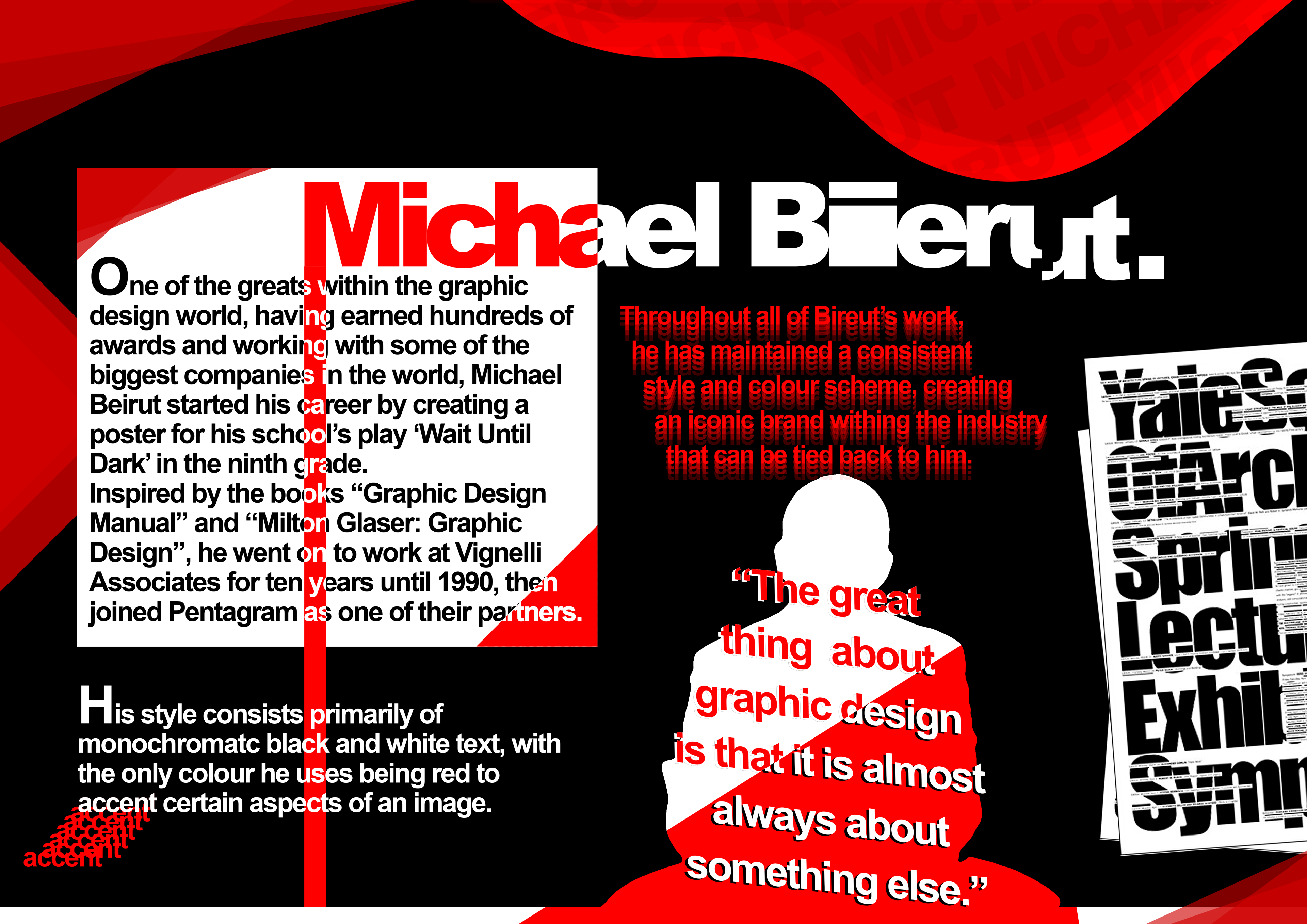
Michael Beirut Artist Research
Scale Poster Workshop
Blend Tool Workshop
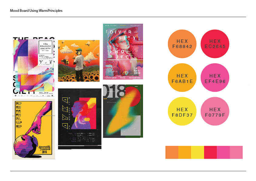
Warm Colour Mood Board
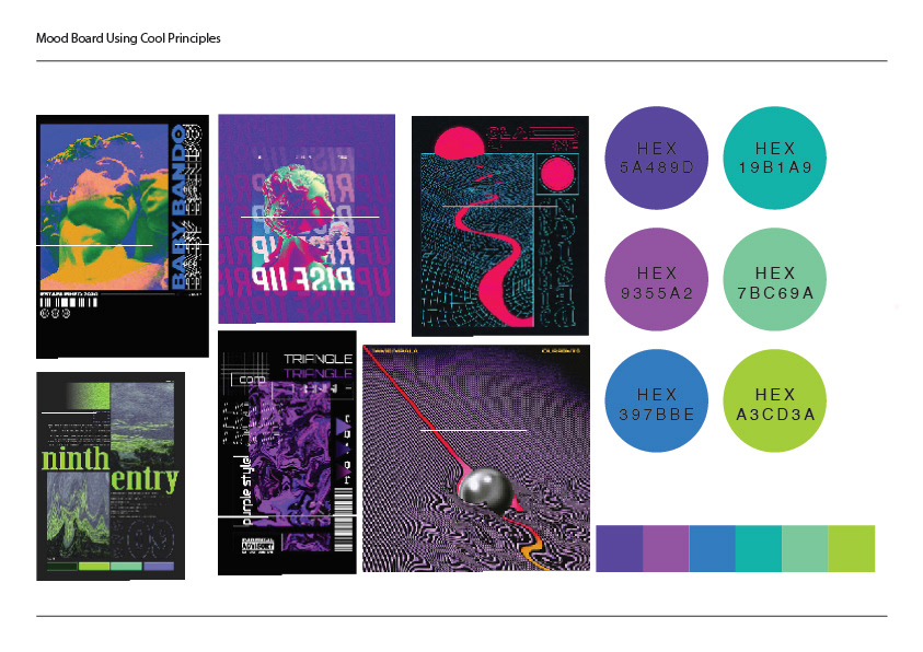
Cool Colour Mood Board
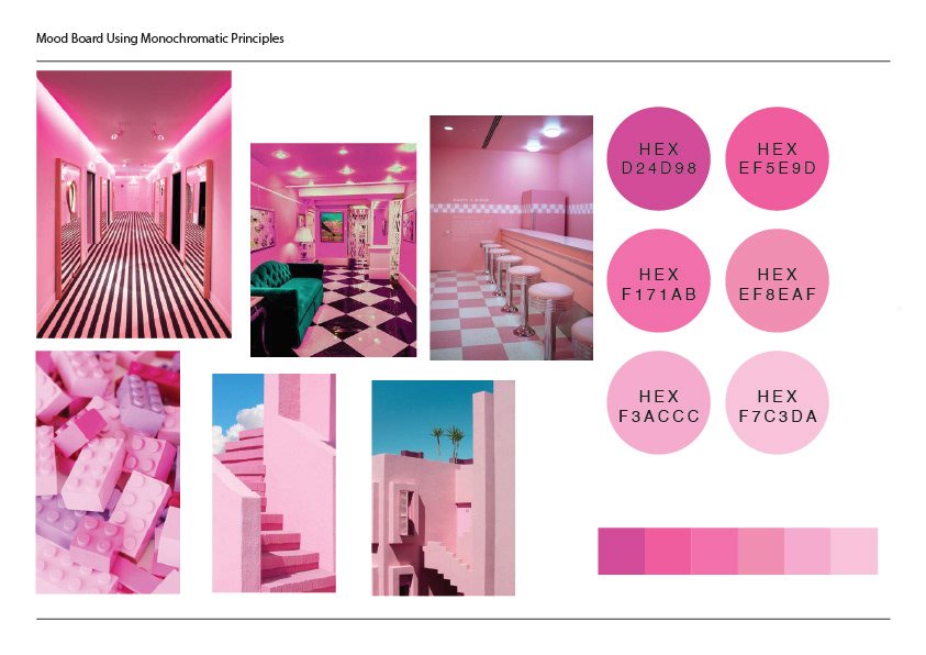
Monochromatic Colour Mood Board
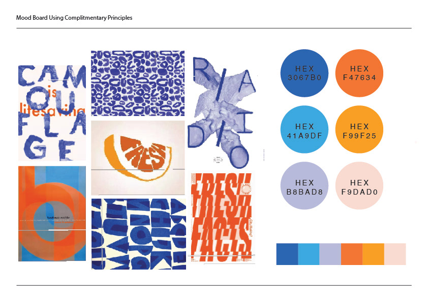
Complementary Colour Mood Board
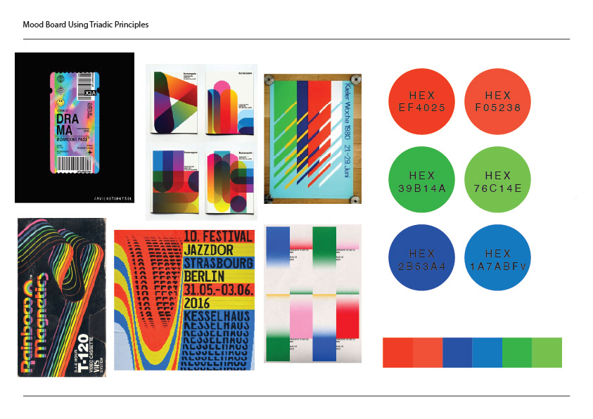
Triadic Colour Mood Board
Final Written Evaluation – Michal Sienkiewicz
In this project, I aimed to achieve a set of skills and document the learning processes, as well as create a zine for the final piece with the overall theme of the project being “experimental typography”.
During the project my I have developed many skills, such as learning how to use various software like Photoshop, Illustrator and InDesign, furthering knowledge about important ideas within graphic design like how to professionally structure text and most importantly experimenting with bold or risky ideas.
To inspire my work, I have looked at the artists Paula Scher, Vasjen Katro and Michael Beirut and taken notes on their backgrounds, processes and techniques to create and develop my own pieces inspired by them. The work I have done helped me to further develop my works by showing me different ways to approach an idea or different experimental techniques that could be used, such as bold stylistic choices that I would have not attempted had I not experimented with other aspects of my work.
During the course of my project, my graphic design skills have come in very useful, as they have provided me with knowledge of how to achieve a certain aesthetic choice that I would have struggled with had I not learned these skills. I have experimented with monoprinting, linograph printing, foam printing and trapping throughout this project and by doing this I have created pieces about these techniques.
To create my zine, I used mainly paper, with plastic and lino being used to create some of the individual pages. Some of the techniques I have used are lino printing and trapping, and I feel as though the outcome of these techniques is done well. For the linoprinting, I experimented with using a mix of colours, being a blend of red and green which helped make it more interesting than simply using one colour. For the trapping, I used a range of letter styles and sizes, some being serif and others being sans-serif. About the final outcome, I think it has been a success. I experimented with different typographic ideas and methods, with my favourite being the usage of a CD to line up different letters together. However, I think it could be improved by using more of the printmaking methods that I learned, which I did not do due to not being fully comfortable with them.